
Overview
shadcn/ui Pro is a paid product built on top of the open-source shadcn/ui component collection, which itself is a set of React components styled with Tailwind CSS and primitives from Radix. Where the free library stops at individual primitives such as buttons, inputs, dialogs and tables, this product supplies the assembled material a real project needs: complete marketing sections, application screens and storefront flows, plus a Figma counterpart that matches the code one-to-one, a theme layer, and an MCP server that exposes the whole library to AI coding agents.
The problem it addresses is familiar to any team working in this stack. shadcn/ui is deliberately unopinionated and copy-paste oriented, so every new landing page, pricing table, sign-in form or dashboard sidebar gets rebuilt from scratch, usually with small divergences between what a designer mocked up and what an engineer shipped. shadcn/ui Pro closes that gap by treating design and code as one artefact: the same 56 components exist as Figma components and as React source, blocks install with a single CLI command, and themes are expressed as CSS variables that both sides consume.
Its position in the market is deliberately narrow. It is not a UI framework, a hosting platform or a design tool; it is a registry plus a design system plus tooling aimed at people already committed to the shadcn/ui + Tailwind + React combination. The site reports over 13,000 designers and developers using the product and an average rating of 4.9 out of 5, though the review methodology behind that figure is not disclosed. What is disclosed is the inventory: 439 blocks in 61 categories, 56 Figma components, 18 themes, one MCP server covering 20 AI clients, and 10 Agent Skills.
Key Features
439 blocks across 61 categories. The library is split into 235 landing page blocks, 121 user interface blocks and 83 e-commerce blocks according to the site's own footer counts. Coverage runs from hero sections and pricing tables to AI chat panels, command menus, onboarding flows, dashboards, checkouts and order summaries. Every block is described as responsive, accessible, and available in both light and dark variants built on the same design tokens.
Single-command installation through the shadcn CLI. Blocks are delivered as a registry entry rather than a package, so adding one is a matter of running npx shadcn@latest add @shadcnpro/pricing-01 after connecting the project to the Pro registry once. The output is plain source files inside the repository, with no runtime dependency and, according to the licensing FAQ, no license check embedded in the shipped application. That distinction matters for teams that need to audit or fork what they deploy.
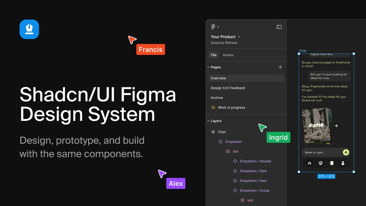
A Figma kit that mirrors the code one-to-one. The design side ships 56 components with every variant, size and state, built on Figma variables and auto layout rather than detached styles. The kit covers light and dark modes, eight visual styles and five icon libraries. Component pages list concrete capabilities — Button with variants, sizes, icons and loading states; Calendar with single, range and multi-month modes; Data Table with selection, sorting and pagination; Field with label, control, hint and error slots. The stated goal is that a frame handed to an engineer produces the same component the code library would provide.
Theme builder with 18 ready-made themes. Themes are distributed as CSS custom properties and can be installed with a CLI command or copied directly. A live builder exposes base color, radius and token values with an immediate preview, and the site demonstrates a side-by-side comparison between stock shadcn/ui and a branded variant. Because themes are token-based, they propagate to every block and to the Figma kit without per-component edits.
MCP server for AI editors. The Model Context Protocol server lets an agent search the block catalogue, plan a page and install matching blocks with the correct install commands, themes and Figma links. Setup is documented for 20 clients including Claude Code, Cursor, VS Code, Codex, Windsurf and Gemini CLI; the canonical command is a single claude mcp add invocation with an HTTP transport and a bearer licence key. The practical effect is that an agent asked for a three-tier pricing section retrieves pricing-03 from the registry instead of hallucinating one.
10 Agent Skills for repeatable workflows. Skills go beyond retrieval and encode whole jobs: /shadcnpro-generate-code turns a Figma frame into a React component assembled from the project's own shadcn/ui primitives, /shadcnpro-import-variables writes a Figma file's colours, radius and fonts into the global stylesheet in the format already in use, /shadcnpro-design-screen builds screens inside Figma from kit components, /shadcnpro-create-page composes full pages with shared navbar and footer, and /shadcnpro-apply-brand pushes brand tokens across a project.
Framework and primitive flexibility. Blocks are stated to work with React and are supported across Radix UI, Base UI and React Aria primitives, which means a team that has already standardised on one accessibility layer is not forced to migrate. Installation targets any project containing a components.json file, which is the standard marker of an initialised shadcn/ui setup.
Commercial licensing with source ownership. Every tier grants unlimited commercial projects, including client work, while prohibiting resale or redistribution of the blocks, kit or themes as a template or UI kit. Code installed into a repository remains the customer's even after a subscription lapses, which removes the usual lock-in objection attached to component marketplaces.
How It Works
The entry point is an existing shadcn/ui project. Teams need a components.json at the repository root — npx shadcn@latest init creates one if the project is new — and then a one-time connection to the Pro registry, documented in the installation guide. From that point the workflow is identical to using the public shadcn registry: search the catalogue on the site or through the MCP server, run the add command with the block slug, and the component, its dependencies and its styles land in the codebase ready to edit.
On the design side, the Figma kit is duplicated into a workspace and immediately shares variable definitions with the code tokens. A designer selecting a card, a field or a data table works with the same variants an engineer will install, so the handoff conversation shifts from rebuilding to adapting content. The theme builder sits between the two: pick a base colour and radius, preview the result on a realistic dashboard mock, then export the CSS variables or install them via CLI so both the codebase and the Figma variables agree.
Agent workflows collapse several of those steps. With the MCP server connected, a developer can describe a page in natural language; the agent queries the registry, selects blocks, and issues the install commands itself, reporting which components were created. Agent Skills extend this to Figma — a frame link pasted into Cursor can return a component built from the project's own primitives, with matching blocks installed rather than reimplemented. The site's own demo shows a terminal installing a hero and a pricing block while the browser preview updates, which is a fair representation of the interactive loop.
Day-to-day usage settles into a rhythm: designers compose screens in the kit, developers pull corresponding blocks, themes keep both sides aligned, and the agent handles the mechanical parts of page assembly. Onboarding takes minutes rather than days because the entire toolchain is the standard shadcn CLI. The one sequencing wrinkle is that the Figma kit unlocks only after the first payment, so trial users evaluate the code side first and the design side second.
Use Cases
A freelance developer shipping client landing pages. A solo operator billing fixed-price projects can assemble a full marketing site from hero, features, pricing, testimonial, FAQ and footer blocks in an afternoon, then apply a client's brand through the theme layer. The $9 per month Freelancer tier allows one user and unlimited commercial projects, so the cost is absorbed by a single engagement. The outcome is fewer bespoke components to maintain and a predictable visual result across clients.
A product team standardising an internal dashboard. Teams building admin surfaces can install dashboard, sidebar, command menu, dialog and onboarding blocks that already share tokens and accessibility behaviour. Because blocks arrive as source, an engineer can strip or extend them without fighting an abstraction layer. The frequent outcome here is reduced drift between the design file and the shipped interface, since both originate from the same component definitions.
A design systems lead reconciling Figma and production. The 1:1 claim is the selling point for anyone who has maintained a parallel Figma library and watched it decay. With variables bound on both sides — including additional semantic tokens such as warning and info that shadcn/ui does not include by default — the maintenance surface shrinks to a single source of truth. The kit's use of Figma slots rather than older workarounds also makes extension safer for teams that customise components.
An agency running several concurrent builds. The Agency tier covers up to five users and 24-hour support, which suits a small studio where designers and developers alternate across projects. Shared themes and a common block vocabulary mean a new team member can be productive on an unfamiliar codebase quickly. The unlimited commercial project clause removes the per-client licensing negotiations that usually accompany component marketplaces.
An AI-first developer working inside Cursor or Claude Code. For teams that code primarily through an agent, the MCP server and Agent Skills change the economics of generation: instead of asking a model to invent a pricing table, the agent retrieves a tested one. This reduces review overhead on generated markup and keeps output consistent with the rest of the codebase. The site's customer quotes echo this pattern, with developers citing faster layout assembly from the agent context.
Pricing & Value
Three tiers are published, all with identical feature access; they differ only in seats and support responsiveness. Freelancer is $9 per month for one user, Agency is $19 per month for up to five users and is marked as most popular, and Enterprise is $79 per month with unlimited users. Yearly billing is listed at $72, $144 and $588 respectively, and lifetime options exist as one-time payments of $99, $199 and $799. Every tier includes the full 439-block catalogue, 18 themes, the Figma kit, the MCP server, 10 Agent Skills, updates and priority support.
Monthly and yearly plans open with a 7-day free trial: a card is required at checkout but nothing is charged until the trial ends, and cancellation before that point is free. The Figma kit is the single exception to day-one access, waiting for the first payment. Without any plan, 62 of the 439 blocks can be installed and the theme builder with its 18 themes is usable — enough to validate the workflow before committing.
The value calculation depends entirely on throughput. A developer who installs three or four blocks a month is effectively paying for a few hours of saved labour; one who assembles several pages per quarter recovers the annual fee almost immediately. Compared with design-system marketplaces that charge several hundred dollars for a static Figma file alone, the combination of code registry, design kit and agent tooling at $9–$19 per month is aggressive. The lifetime tier at $99 for a single seat is the strongest offer for freelancers who expect to keep using the stack. Full tier details are published on the pricing page.
Who It's For
This product fits teams already committed to React, Tailwind CSS and shadcn/ui. Small product teams and startups get the most leverage, because they need breadth quickly and cannot afford a full design-system build-out; the shared Figma and code vocabulary removes an entire class of handoff defects. Agencies and freelancers benefit from unlimited commercial projects and a low monthly commitment. Design engineers who move between Figma and code daily are the ideal user, since both halves of the product are useful to the same person.
The MCP and Agent Skills features target a narrower but growing segment: teams whose primary editing surface is Cursor, Claude Code or a comparable agent. For those groups the registry is arguably more valuable as retrieval infrastructure than as a component library.
Several audiences should look elsewhere. Teams on Vue, Svelte or Angular have no path here, since the blocks are React and Tailwind. Organisations with a mature, bespoke design system will find the kit redundant and the tokens conflicting. Designers who do not touch code can use the Figma kit in isolation, but the subscription only makes sense if the paired code side is also in play. Finally, anyone unwilling to adopt the shadcn CLI workflow will find installation more friction than benefit — the product assumes that toolchain rather than working around it. Teams that only need a handful of sections should start with the 62 free blocks and browse the block library before paying.
Final Thoughts
shadcn/ui Pro is a well-scoped answer to a real gap. The open-source library solves primitives; almost nobody ships primitives. By supplying assembled sections, a mirrored Figma kit, a token-based theme layer and an agent-facing registry, the product covers the entire path from mockup to deployed page using tooling the target audience already has installed. The decision to deliver source files rather than a runtime package is the right one, and the absence of an embedded license check means installed code behaves exactly like hand-written code.
The strongest differentiators are the one-to-one Figma claim, which is rare and difficult to maintain honestly, and the MCP server, which converts the library into something an agent can query rather than something it must imitate. The Agent Skills layer is a sensible extension of that idea, encoding recurring jobs such as variable import and page composition as repeatable commands.
The weaker spots are structural rather than technical. Most of the catalogue is gated behind a subscription, with only 62 of 439 blocks available free, and the Figma kit is withheld until payment clears — a sequencing choice that prevents trial users from evaluating the half of the product that most needs verification. There is also no public repository or changelog referenced for the Pro assets, so prospective buyers must take ongoing maintenance on trust. Detail on the AI-side mechanics lives at the MCP documentation, and the Figma component inventory is browsable on the Figma kit pages.
Overall, the recommendation is straightforward for the right buyer: any React team using shadcn/ui that ships marketing pages or application screens regularly will recover the fee quickly and gain consistency between design and code. Teams outside that stack, or those needing only a few components, should wait.